This is the blog format of a talk given at State of the Map US 2026. I hadn’t presented a talk in a few years, and they’re great motivating factors for polishing up side projects. The submission deadline for conferences is quite a few months before the conference itself, so I put down the gist of the talk before and planned to finish the project if it was accepted. I opted for a 5 minute lightning talk, knowing that if all else failed I’d at least be able to show a few pictures.
It was accepted.
Setup
Python!
For this project, I used python to download and transform OpenStreetMap data as well as to preview and generate the SVGs for plotting.
I made great use of iPython/Jupyter notebooks for these projects, as it’s nice to have variables floating around in memory for quick iteration and visual debugging.
This is the main collection of packages needed to run the code in this post. Other packages will be pulled in as dependencies (ex. shapely).
Loading OpenStreetMap Data
There are 101 ways[1] to download OpenStreetMap data. For this example, I’m going to use the overpass python package. Overpass isn’t my favorite, due to the query language, but it’s useful for quick projects and portability.
First, pick a bounding box using the ever-trusty bboxfinder.com[2]. Since the conference was in Madison, Wisconsin - the map will be of Madison, Wisconsin!
I’m going to skip explaining OverpassQL as there are other resources out there.
The two features I’m pulling to use for the map are cafe[3] nodes amenity=cafe and lake way and relations natural=water, water=lake. It may also make sense to pull cafe ways, as cafes can be mapped as polygons as well but that exercise is left to the reader.
SVGManager is manipulating information in cartesian space. It’s created with a number of pixels (like 500 x 500) which we have to draw our map data on. The problem is our map data is in Web Mercator coordinates (EPSG:3857). We will need another set of utilities to re-project our data from that space, to the pixels that make up our SVG.
""" Utilities to convert to scaled SVG coordinate space """ from functools import partial from shapely.ops import transform
# Function to project a single (x, y) pair to canvas units def_project_to_canvas(x_3857, y_3857, scale, min_x, min_y, x_off=0.0, y_off=0.0): x_rel = x_3857 - min_x y_rel = y_3857 - min_y
Are there better ways to do this? Probably. For one, you can do this all in QGIS which has SVG export support as well as great plugins for downloading OSM data. But I’m already here, and so I continue on.[4]
While AI tools make this type of work a lot quicker than before, some of the fun was the messy maps that would come from getting the math wrong. While I won’t claim that writing the code yourself makes you a better person, I would at least suggest modifying random things to see what happens. One nice thing is the wealth of debug information you can have presented to you.
This first one will print out the scaling information, for example with our Madison example and a 500x500 SVGManager we get the following:
1 2 3 4 5 6 7
=== Projection Debug === source bounds: (-9968375.512, 5314702.778) -> (-9936177.885, 5336133.000) source size/aspect: 32197.628 x 21430.223 | aspect=1.5024 target frame: 500.000 x 500.000 | aspect=1.0000 used frame: 499.000 x 332.126 | scale=0.01549804 projected size: 499.000 x 332.126 margins L/R/B/T: 0.500, 0.500, 83.937, 83.937
The following utility will adds a blue bounding box around the map data. As you can see above, the “projected size” is 499x332. This means we don’t use up the whole canvas, and this blue box will visualize that new rectangle.
Let’s get back to cafes and lakes. At state of the map, I showed the difference between plotting three different representations of this data. The first was to plot it “plainly”, as a dot density map, as this will draw the cafes as points and the lakes as polygons.
This is quite straightforward, initialize an SVGManager and draw the things.
1 2 3 4 5 6 7 8 9 10 11 12 13 14 15
from pandas import concat from geopandas import GeoSeries
SVG plot proof showing Madison's cafes and nearby lakes.
This leaves something to be desired though, especially at different zooms. Where the overlapping points will mean the pen repeatedly marks the same spot.
Buffer and Dissolve
Two classic geospatial operations for manipulating polygons are buffer and dissolve. Buffer is the process of increasing the size of the shape, points will turn into polygons and polygons will turn into bigger polygons. We do this to prepare the data for our next operation, dissolve. Dissolve will join overlapping polygons, optionally grouped by a specific attribute.
I use an AxiDraw V3 which is no longer available, though there are many other plotters now available.
With buffers + dissolve
What’s next?
This buffer and dissolve technique is great at all scales or with all shapes of data. Convex hull is another fun operation to pull points together. Think about what you’re trying to show - and the constraints of dragging a pen across the paper to do so.
References
For example, I learned about layercake at the conference. ↩︎
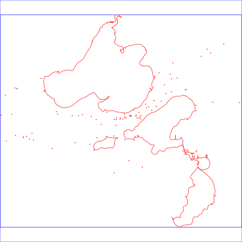 SVG plot proof showing Madison's cafes and nearby lakes.
 Top: Two 'Points', Middle: Two Buffered 'Points', Bottom: Two Buffered + Dissolved 'Points'