SlowMapChallenge 2021
Intro
Another year, another map challenge to squeeze creativity out of me. The #30DayMapChallenge started today to another round of great point maps. I don’t quite have the time or energy to go through that again this year but luckily I stumbled across the #SlowMapChallenge last week. To honor the spirit of slowing down, I’m starting this a week and a day late. Though I did “like” it around the time it was posted, that should count for something.
Week 1/2
Hammond’s Atlas
Months ago I became obsessed with the simple style of the Hammond’s Great Cities of the Word after buying a couple of those maps that had been cut out of the atlas and framed individually, a fate known by too many dusty atlases turned trendy art piece. Long story short, I found a copy of the original book and have thought about replicating the style since.
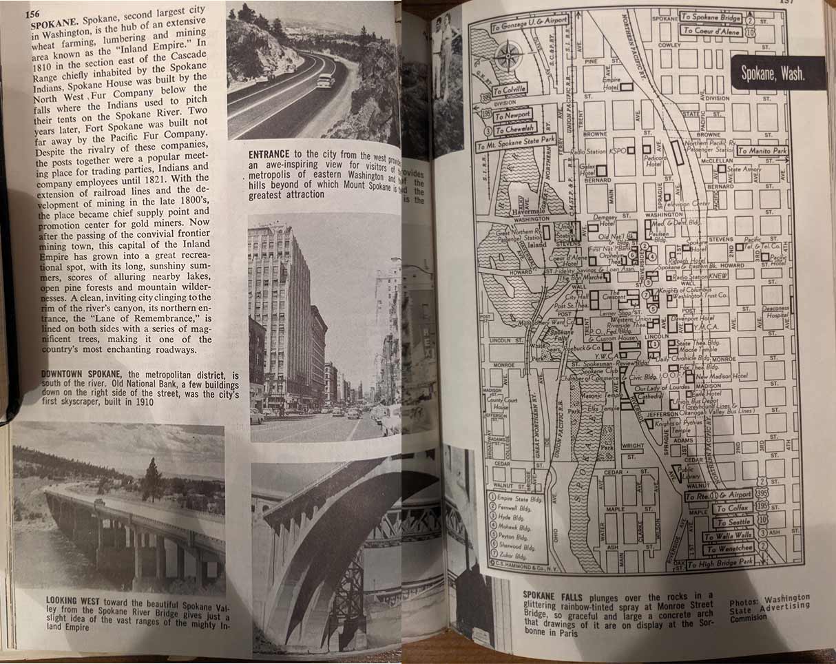 Map of Spokane
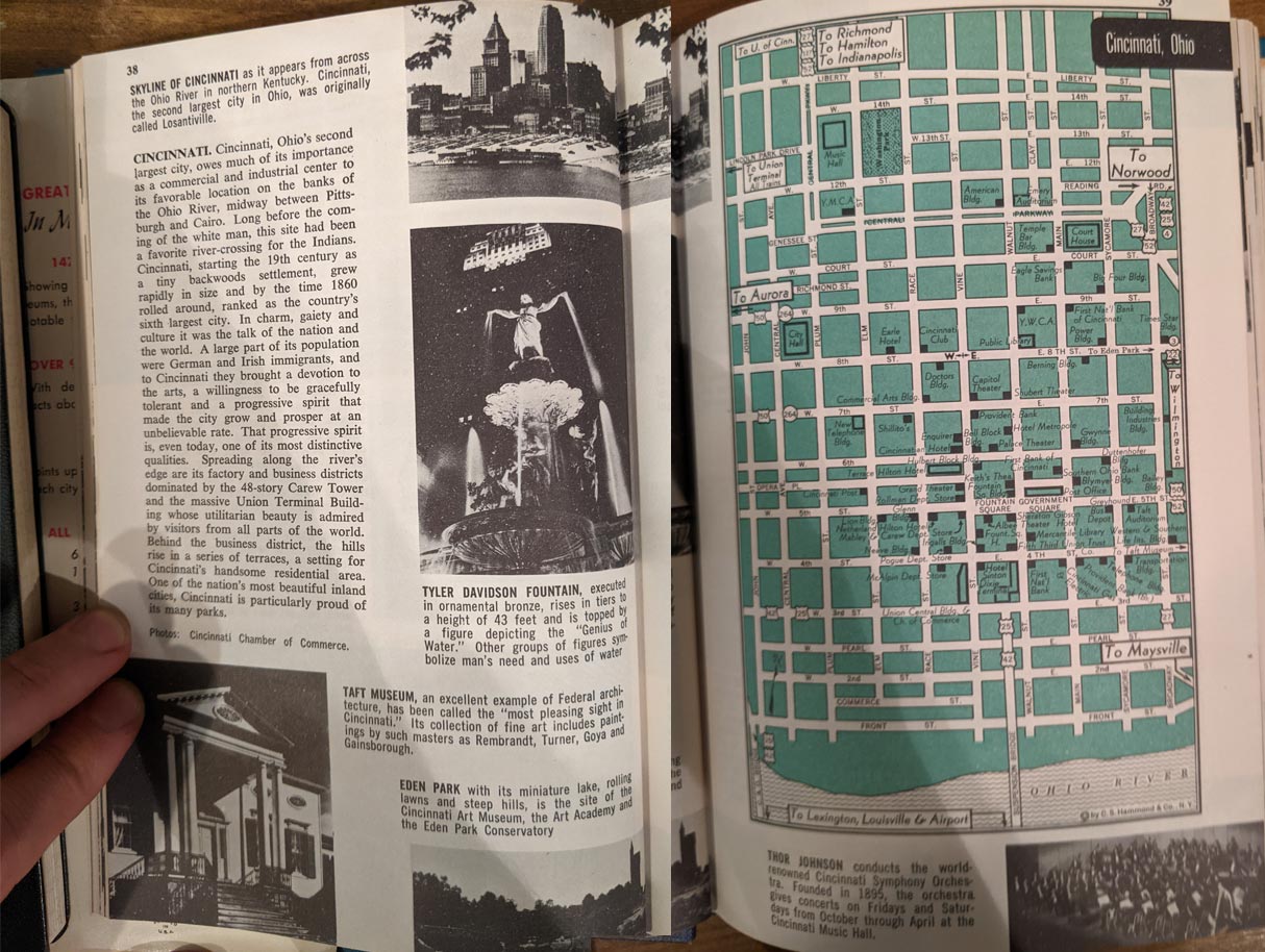 Map of Cincinnati
These maps are intended to give you an overview of a far away city of which you may know little about. They highlight the author’s chosen landmarks with black boxes or square and leave the rest of the city an anonymous street grid. The book’s copyright put its at 1958, a time before highways ripped through many of our American cities.
Map Corporation of America’s Map of New York City
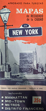 Map Corporation of America's Map of New York City
Another map I bought recently (for $2 at a street fair, though Argosy has it for $165) is an old map of NYC. The cover is in Spanish, though they didn’t go through the trouble of translating the rest of the map.
 Overview Side, Apparently 'Greenwich Village' is the only neighborhood important enough to label.
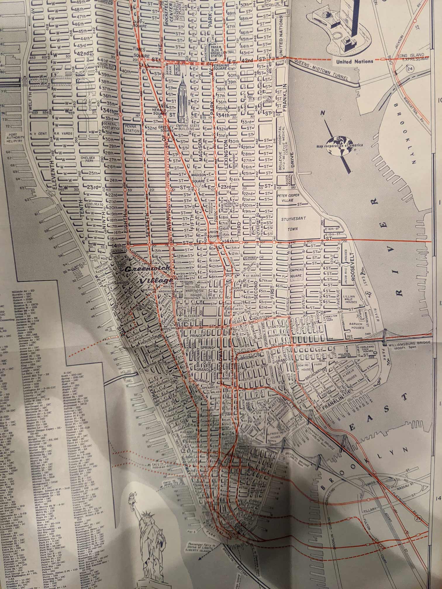
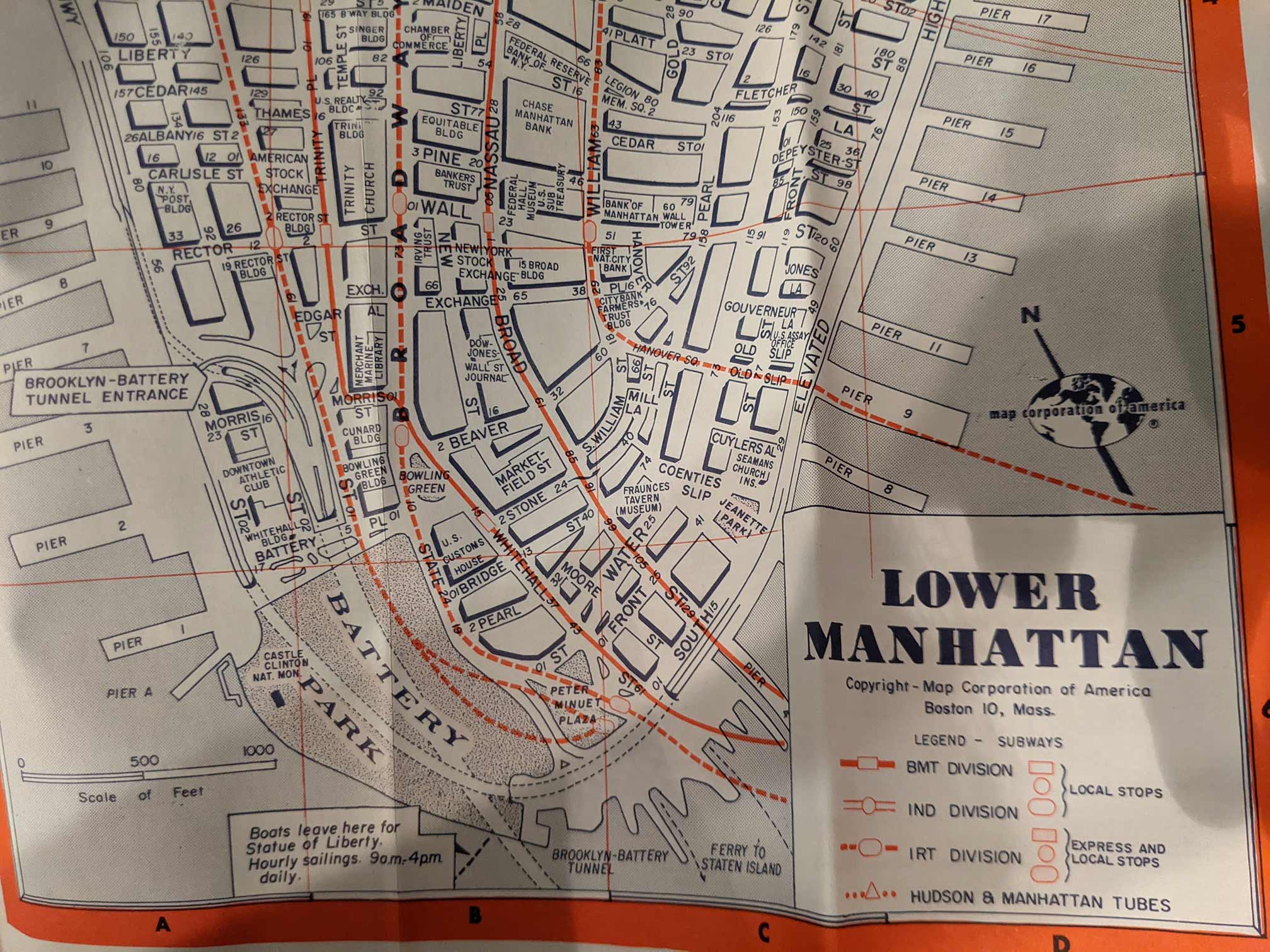 Zoomed Side of Lower Manhattan, checkout that '3D'
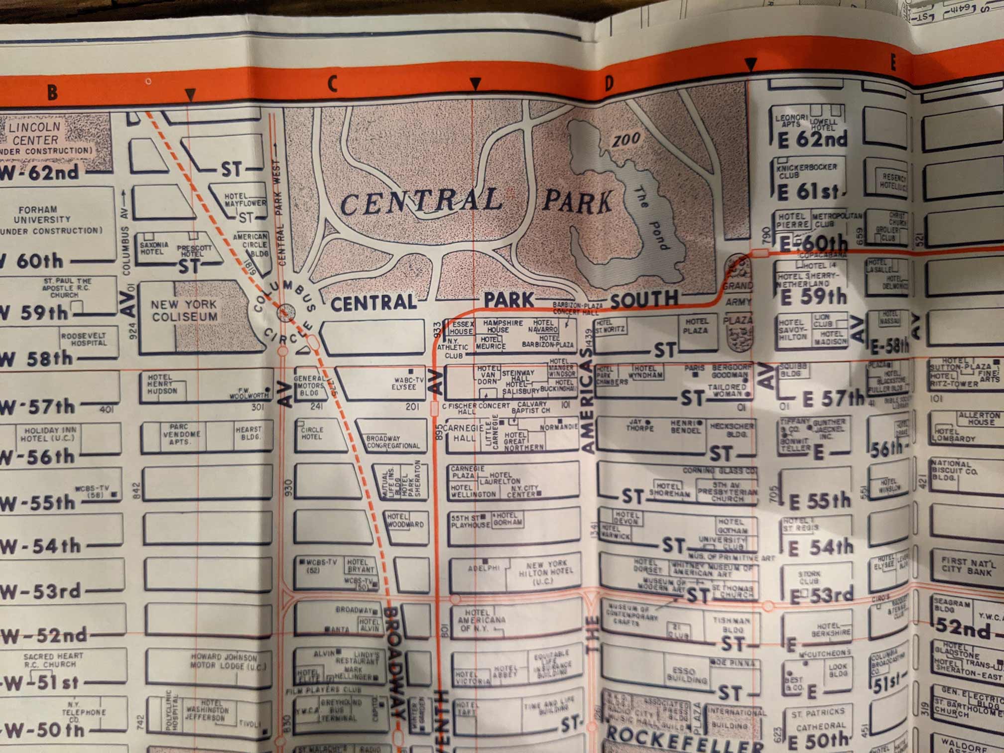 Zoomed Side of Central Park South, all those empty blocks - don't matter.
Plan
Over the next 10 weeks I’ll try and work on a map inspired by these mid-century maps. One that features few colors, great fonts, minimal text, few points, and dotted land cover. A guide for a city with attractions, whatever those may be. I haven’t picked a place to map yet, but it will probably be a neighborhood here in NYC. After that week’s work session, I’ll hopefully have some time to update the progress on this page.
Week 3
Data Prep
One of the first things you do after deciding to make a map is figuring out if it’ll actually be possible with the data you can access and amount of time you have. It would take a long time to draw each block polygon individually, and I have a loose goal of being able to replicate this style so I’d like to find an automated way of drawing them.
I googled “polygons from lines” and was reminded that this function is often known as “polygonize”. Time to fire up QGIS and load in the roads. I used the QuickOSM plugin to download all the features with the key highway. After messing around with reprojecting, polygonize, buffering and styling I found something really close to what I wanted.
The Process
- Download highways using QuickOSM
- Filter away features with the highway values: footway, steps, elevator, service (probably many more depending on your area)
- Reproject to a meter based coordinate system
- Run “Polygonize”
- Negative buffer of 5-10m
- Throw in some drop shadow
After writing out this list, I realized this would be a great time to use the QGIS model designer and save this process for next week (I’m not sold on an area to map yet).
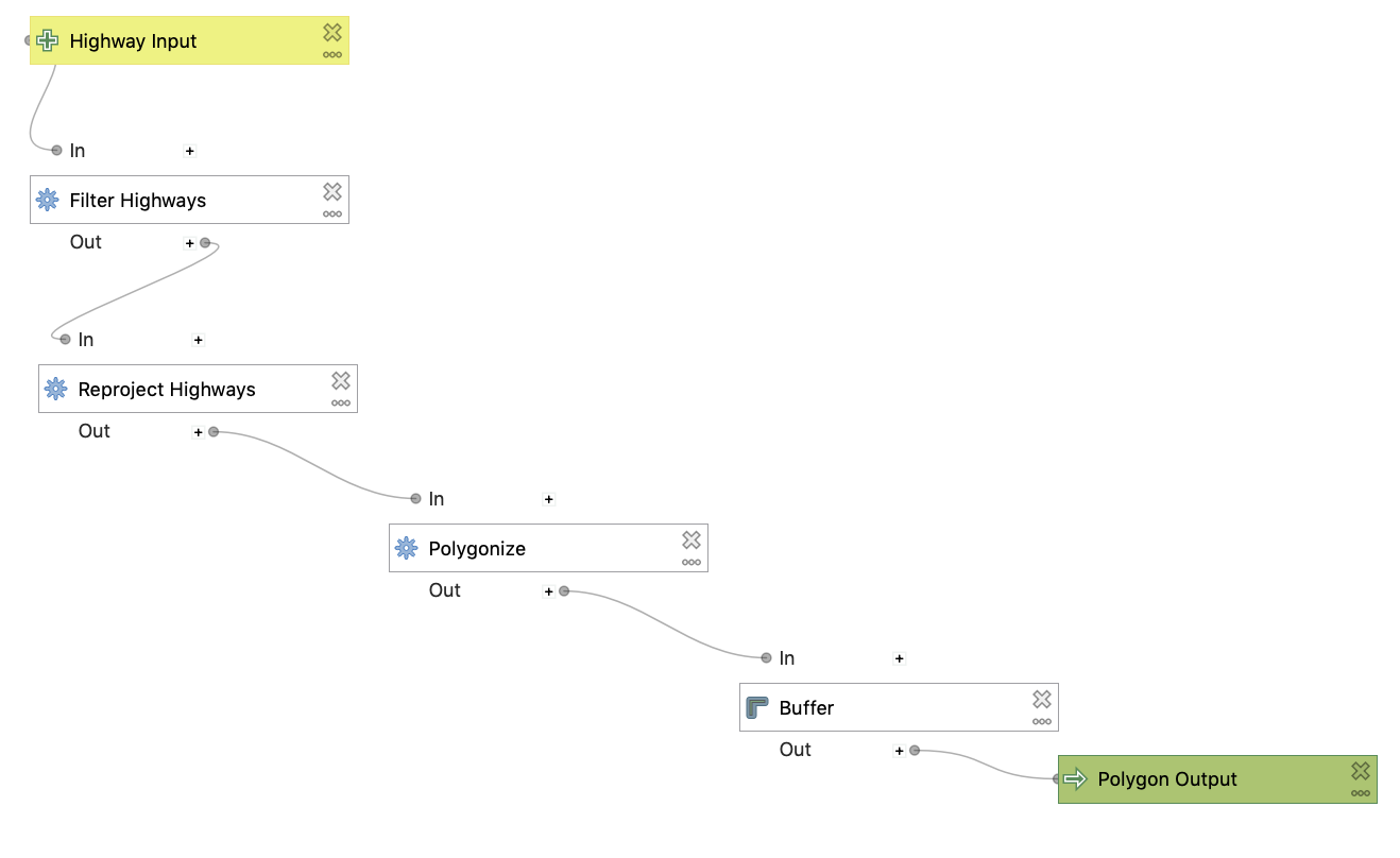 The Process in QGIS Model Designer
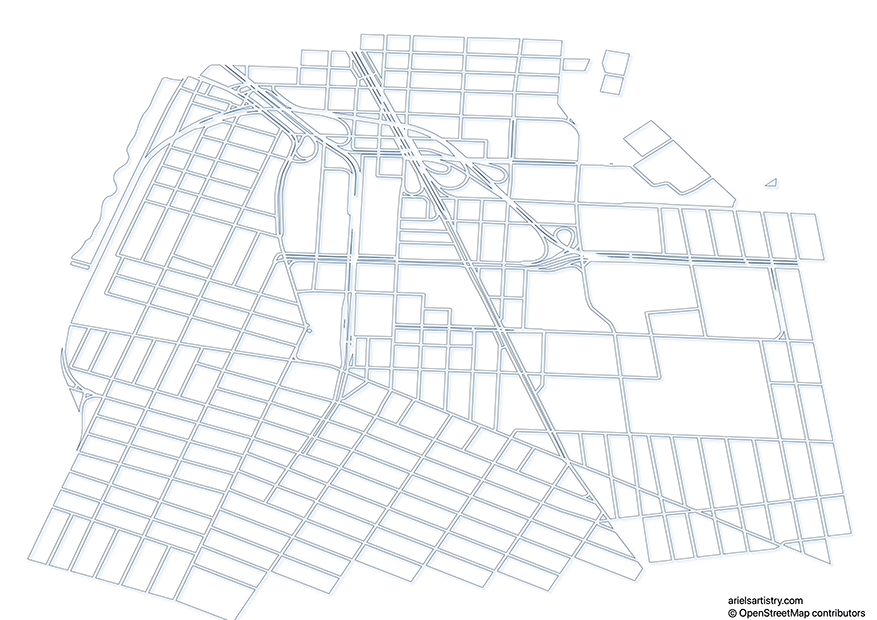
Results
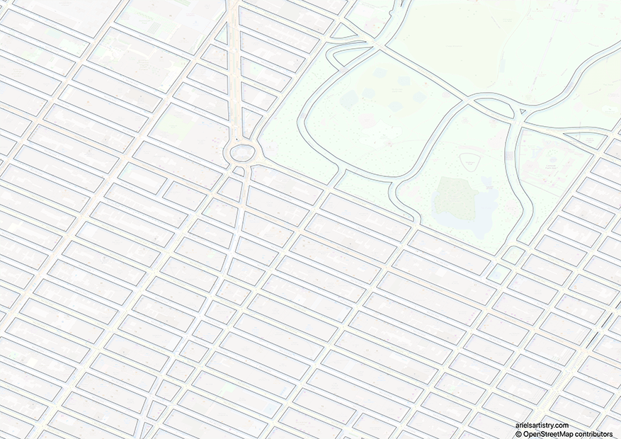
 Downtown Brooklyn
Removing everything else from the map brings out the clean block grouping I’m looking for. The trick in the coming weeks will be picking the right features to complement this look as well as provide the context the map needs.
 Midtown Manhattan
Bringing OSM back into the background helps think about what else we may need to pull from there.
Week 4
Week 4’s update has been delayed due to printer issues.
Week 5
What’s left to do? A couple ideas: pick fonts, make the polygons “pop” with a shadow/glow. pick out POIs, decide on POI symbology, think about colors (or lack of), draw supporting illustrations, write supporting blurbs, come up with an appropriate title, pick hatching for water, pick different hatching for parks, stare at the hatching and hope they’re different enough, etc. For this week I’ll focus on the first two.
Fonts!
I am not a font person. I have to Google the difference between “Sans” and “Sans Serif” every time. Then I search which you’re supposed to use for maps. Sometimes I use default fonts, sometimes I pick cool fonts. I’ve read about fonts plenty of times but I never retain any of that knowledge. I have a handful of downloaded fonts, and I like the idea of searching for fonts for a project to complete the look. For the maps I’m looking at recreating, I think there are two fonts used. A bold font for street numbers and big labels as well as a “softer” font used for POI labels and inserts. WhatTheFont has a great tool for uploading images and trying to determine which font was used and I started there. After some searching, I finally found a font (Hemispheres Bold Sans) I felt came close for the “bold” font though it does not have the lowercase letters.
I have a couple choices for the smaller font, including an option from Mazzard, Simpliciter, or even Twentieth Century. I’m not sold on any of these yet.
Shadows!
The next thing I wanted to work on this week were the shadows that make the block polygons “pop” out of the page. I’m using Affinity Designer for this project (after exporting the data out of QGIS as SVG). I found this forum question on putting together drop shadows. After fiddling with those settings I settled on an Outer Shadow with radius: 1px, offset: 1px, intensity: 60%, angle: 225.
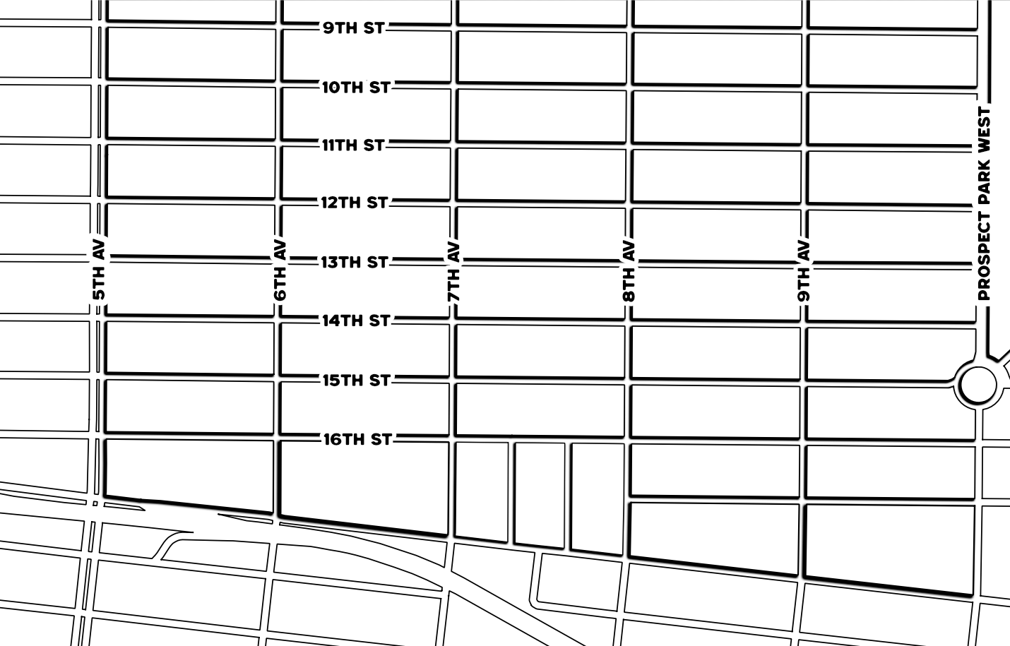 Hemispheres Bold for Street Labels, Outer Glow for Polygon Shadows